
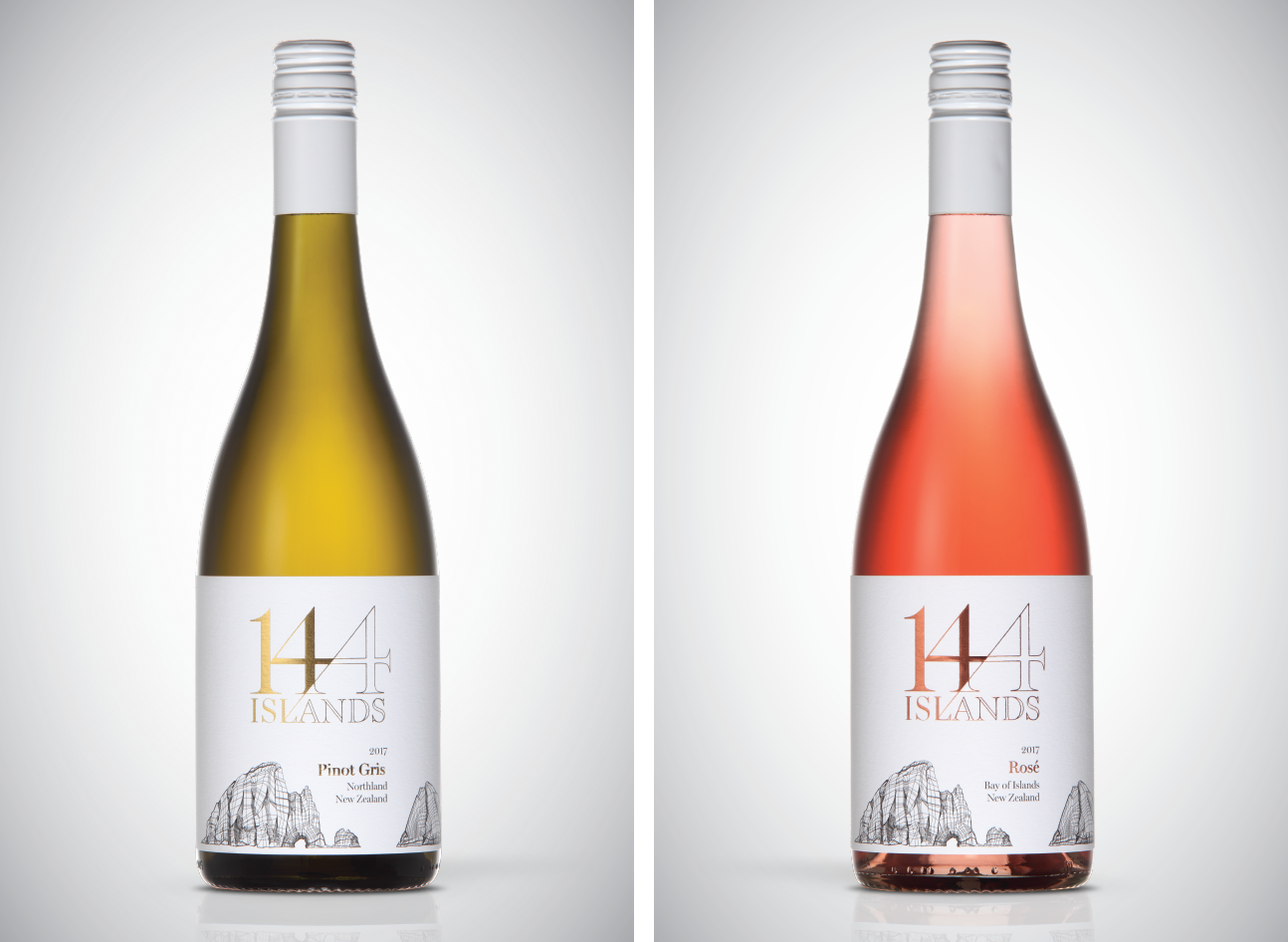
144 Islands
Brand identity.
Packaging.
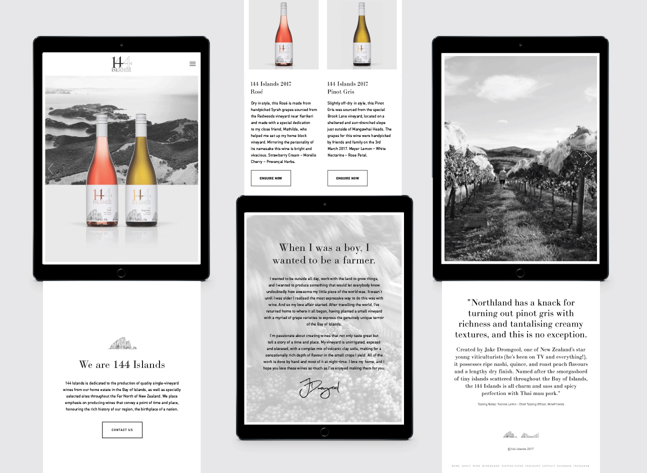
Website.
When a young up-and-coming viticulturist approached us to help develop his burgeoning 144 Islands brand, I relished the challenge. With a direct reference to the number of islands in the vineyard’s surrounds the strong serif typeface and topographic landscape embodies the heritage of the location and hints to the netting used in the craft. The unencumbered crisp, fresh look captures the youthful optimism and natural energy of both the maker and the wine.


Produced at Davy & Chapman